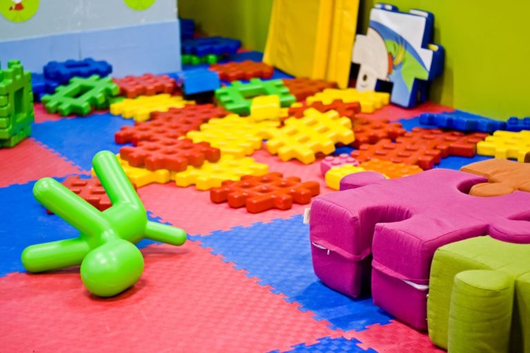
Colour is the most important factor for consumers when they are making a purchasing decision. 93% say that colour and visual appearance is their primary focus when deciding whether to buy from a store. A large number of shoppers don’t return to a store because they don’t like the aesthetics.
As a retailer you can carefully select colour schemes for your retail fitout that send the right message about your brand and can influence the behaviour of people that walk through your doors.
I want my customers to think, feel or do X, Y & Z, what colours should I use?
Trust, loyalty, security.
Blue. People associate a sense of security and trust with blue tones. Using blue in your stores and branding is also more likely to create a sense of loyalty. Many banking corporations or other financial institutions use blue in their branding and in-store because they are high-risk services that you need trust in to feel safe investing with.
Wealth, environmental, relaxing.
Green. Green is a colour associated with being environmentally friendly. As green is the easiest colour for the eye to process it is also used to relax customers in stores. It is important to remember that if you are trying to come across as having sustainable products you will need to back this up with your product range or consumers will become disgruntled.
Power, luxury, control.
Black. Black is a colour that has strong connotations of being powerful, sleek and luxurious. High end brands often use black to communicate to customers that their products are of higher value. Generic beauty products using black packaging or in a store using black in their branding are perceived to be of higher value than the same product using colours.
Clear call to action, customers know what to do.
Orange. An aggressive colour, orange is very bright and in-your-face, and will grab attention. This makes it opportunistic to use this colouring around call to actions in-store. Clear call to actions make it easier for the customer to act in a way that adds value to your business.
Optimistic, fun, youthful.
Yellow. Much like orange, yellow is a bright colour that grabs attention and will draw people into your store. Yellow will also communicate a vibrant and youthful atmosphere and brand personality to customers. If you are wanting to attract younger people or the young at heart, yellow might be the way to go.
Romance, femininity, love.
Pink. Pink has strong ties to romantic feelings and products that are more feminine. If you are a store that sells products supporting femininity or romance perhaps pink is a good option. Too much pink can be overwhelming and nauseating, however, so it is important not to go overboard.
Urgency, energetic, quick sales.
Red. The colour most used in sales signs, red creates a sense of urgency in the consumers and can be used in promotional material around impulse goods or items on sale. People associate red with a bargain or clearance sales. Similarly to pink, too much red can be overwhelming and dilute the communication and highlighting power that it has.
Calm, soothing, non-aggressive call to actions.
Purple. Often used in the beauty industry to create a sense of calm or pharmaceuticals to encourage people to take their medication, purple can soothe people and gently prompt behaviour. People are more willing to spend money when they feel relaxed.
It is difficult to argue against the power that colour has and how it can impact consumer spending. Colour schemes in your retail fitout chosen to generate a certain atmosphere should be supported with store layout, music, approach to customer service and of course the products that you’re selling.
For advice and support throughout your retail fitout journey, contact the experienced team at Perth Citi Fitout on 9249 1347 or get in touch here.